
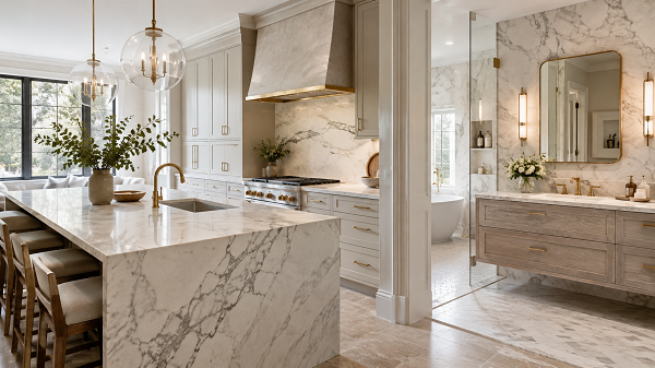
Color has a major effect on how a countertop feels within a room. White can create brightness, gray can add quiet contrast, cream can introduce warmth, and darker colors can create drama. Therefore, homeowners in Milwaukee should look beyond the material name when choosing countertops. Marble and quartz can both offer attractive color directions, but their patterns and visual character can create very different results. A successful countertop palette should connect with cabinetry, flooring, tile, lighting, sinks, hardware, and room size. Therefore, we recommend building the design around the entire space rather than selecting the countertop in isolation.
Begin With the Natural Character of Marble
When comparing marble countertop colors, we should remember that marble is a natural material. Therefore, colors and veins may vary across each slab. White marble may include gray, beige, gold, green, or other natural movement, depending on the stone. This variation can make the surface feel distinctive. However, homeowners should view the actual slab whenever possible because small samples may not show the full character.
Key Takeaways
- Choose countertop colors according to cabinets, flooring, lighting, and room size rather than by trend alone.
- Natural marble variation and quartz pattern consistency create different visual effects.
- Use strong countertop movement carefully so the rest of the kitchen or bathroom remains balanced.
Understand White Countertops
White remains popular because it can make a room feel brighter. However, white countertops are rarely all the same. Some whites have cool gray movement. Others contain warmer cream or gold details. Therefore, homeowners should compare the surface with cabinet finishes. A warm white countertop may look better with cream cabinetry or natural wood. Meanwhile, a cooler white may work well with crisp white, gray, or navy cabinets.
Use Gray for Flexible Design
Gray can fit modern, transitional, and traditional rooms. However, the undertone matters. Cool gray can feel more contemporary. Meanwhile, warm gray can feel softer. Therefore, we should compare gray surfaces against flooring and wall colors. A gray that looks neutral in a showroom may appear blue or beige inside the home.
Consider Cream and Beige for Warmth
Cream and beige countertops can make a kitchen or bathroom feel comfortable and inviting. Therefore, they often work well with warm wood, off-white cabinets, and gold or brass hardware. These colors can also soften spaces that receive limited natural light. However, very yellow undertones may conflict with cooler materials. Therefore, homeowners should compare samples before committing.
Think About Dark Countertops
Dark stone creates visual depth. Black, charcoal, dark gray, and deep brown countertops can become strong design features. Therefore, they often look attractive against lighter cabinets. However, darker surfaces can make a small room feel heavier. As a result, strong lighting and lighter surrounding materials may be needed to maintain balance.
Compare Natural and Engineered Patterns
Marble contains natural movement. Quartz, meanwhile, can provide more controlled patterns. Therefore, homeowners should consider whether they prefer natural variation or greater visual consistency. The available quartz colors for countertops may provide useful alternatives when homeowners want a particular color family with a more predictable appearance. The choice depends on the desired design rather than one material being universally better.
Match Countertops With White Cabinets
White cabinetry creates many options. Light countertops can create a seamless appearance. Meanwhile, dark surfaces can add strong contrast. Marble with gray movement can give white cabinets more depth. Likewise, quartz with warm veins can soften the room. Therefore, the exact cabinet undertone should guide the choice.
Pair Countertops With Wood Cabinets
Wood contains natural warmth and grain. Therefore, countertop movement should complement rather than compete with it. Light wood may pair well with soft white, cream, or gray surfaces. Meanwhile, dark wood can work with lighter countertops to create contrast. Strongly figured wood may benefit from a quieter countertop pattern. This creates visual balance.
Use Countertops to Support Bathroom Design
Bathrooms often contain smaller countertop areas than kitchens. Therefore, strong patterns can feel more concentrated. A dramatic marble vanity can become the main feature in a powder room. Meanwhile, a larger primary bathroom may support longer veins across a double vanity. However, the countertop should still work with shower tile and flooring. Too many patterns can make a bathroom feel busy.
Consider Kitchen Islands
Kitchen islands provide large surfaces. Therefore, marble or quartz patterns can become more visible there. A strong natural marble pattern may create a dramatic focal point. Likewise, quartz with broad veining can provide a similar visual direction. However, homeowners should consider whether the island should match the perimeter. Using the same surface creates continuity. Meanwhile, a contrasting material can add depth.
Think About Natural Light
Light influences how countertop colors appear. Therefore, samples should be viewed throughout the day. A cream surface may look warmer in afternoon sunlight. Meanwhile, gray movement may become stronger in cooler daylight. In Milwaukee, winter light may differ noticeably from brighter summer conditions. Therefore, artificial lighting should also support the chosen countertop color.
Choose Lighting Temperature Carefully
Warm lighting can strengthen beige and cream tones. Meanwhile, cooler light can emphasize white and gray. Therefore, homeowners should consider bulb temperature when selecting countertop colors. Vanity lighting matters particularly in bathrooms. Likewise, under-cabinet lighting can strongly affect kitchen counters. Consistent lighting helps materials look more balanced.
Coordinate the Backsplash
Countertops and backsplashes sit directly together. Therefore, the patterns should complement one another. A dramatic marble surface may need a simple backsplash. Likewise, subtle quartz can support more decorative tile. If both materials contain strong patterns, the room may become visually crowded. Therefore, one feature should usually lead.
Think About Flooring
Flooring anchors the room. Therefore, countertop color should relate to it. Warm wood can connect with cream, beige, or warm gray stone. Meanwhile, cool tile may pair naturally with cleaner whites and gray movement. However, homeowners should avoid forcing exact matches. Slight contrast can add depth while still maintaining a connected palette.
Consider Hardware and Fixtures
Metal finishes can highlight countertop colors. Brass may bring out gold or warm beige movement. Black can connect with darker veins. Meanwhile, nickel can create a neutral look. Therefore, hardware and faucets should be tested with countertop samples. Small finishes repeat throughout the room and can help unify the design.
Use the Sink as Part of the Color Plan
A white sink may blend with a light countertop. Meanwhile, a dark sink can create contrast. Stainless steel generally creates a neutral transition. Therefore, sink material and color should be selected before fabrication. The sink size also affects how much of the countertop remains visible. This is particularly important with dramatic natural marble.
View Large Samples
Small samples can hide major differences in pattern. Therefore, full-slab or large-format viewing becomes especially useful. Natural marble may change significantly from one end of the slab to the other. Likewise, quartz with broad veining may look different across a large island than it does on a small display chip. Therefore, scale matters.
Keep Permanent Surfaces Flexible
Countertops can remain in place for many years. Therefore, homeowners may want colors that support future updates. A balanced countertop can work with new wall paint, cabinet hardware, mirrors, or lighting later. However, flexibility should not remove personality. Natural veining and subtle contrast can create long-term character without depending on one short-lived trend.
Consider Room Size
Small rooms may benefit from lighter or quieter surfaces. However, dark or dramatic countertops can still work when lighting and surrounding colors are controlled. Large rooms can often support stronger patterns. Therefore, homeowners should think about how much countertop area will be visible. The same slab may feel completely different in a small bathroom and on a large kitchen island.
Avoid Mixing Too Many Undertones
A room can quickly feel disconnected when surfaces pull in several different color directions. For example, cool gray countertops, yellow-toned flooring, warm cabinets, and blue wall paint may struggle to work together. Therefore, we recommend choosing a main temperature direction. The materials do not need to match exactly. However, compatible undertones make the room feel more intentional.
Final Thoughts
Countertop color influences how every nearby material appears. Therefore, choosing marble or quartz should involve cabinetry, flooring, backsplash, lighting, sinks, hardware, and room size. Natural marble can bring unique variation, while quartz can provide a more controlled range of patterns and colors. For homeowners in Milwaukee, comparing materials together under real lighting can lead to a stronger long-term design. Ultimately, the best countertop color is not simply the most popular one. Instead, it is the color that creates balance, supports everyday use, and still feels appealing years after installation.
